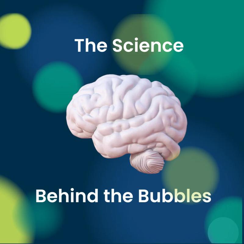
The Science Behind the Bubbles
The concept of thousands of lines of capital and operational expenditure displayed as colourful, interactive bubbles may seem trite. It may even seem downright disrespectful to the financial and business gurus who spend hours in their world of spreadsheets, charts and graphs. But bear with us: there is a science behind the colourful world of OrbViz, and it all started with Barack Obama.
First, let’s look at how nature has hardwired our brains to love all things round.
Circles, circles, and more circles
Here's the thing: circles are all around us (pun intended) from the number of freckles on your arm to the flaming balls of gas known as stars in the sky.
From celestial spheres found in nature to that perfectly round, super supreme pizza you devoured last night, circles are basically non-threatening orbs that say, "Relax: there are no sharp edges here." Scientific studies show that our brains associate circles with safety and comfort, unlike, for example, the pointy end of a cactus. Basically, circles equate to happy feelings.
A world in colour
Colour makes things better. Imagine the green meadows of Austria, the brilliant blue skies of the desert, or the crimson red of a raspberry. Now imagine them in black and white.
Why do we relegate data to the second-class world of greyscale? If it’s a fear of complication and complexity, consider for a moment that colour is an instinctual way to categorise. From the first time we take up a crayon, we rank colours and assign their meaning to things.
Data has the potential to be a technicolour explosion, a confetti cannon of information. Again, science backs this up. Our primal selves instinctively link colour with abundance and joy.
The Bubbles started with Barack
When you combine circles with colour, you have a scientific double whammy of positive association.
Now imagine attaching those positive associations to something that is traditionally dull, hard to understand and even contentious.
That’s exactly what a New York Times data journalist did with Barack Obama’s 2013 budget, which consisted of trillions of dollars of spend. Suddenly, it was easy to grasp – visually - how much money was spent on defense as opposed to, for example, health.
This is the kind of information traditionally housed inside hefty PDF reports that get about as much traction as a Suzuki Swift in a Formula 1 race.
At OrbViz, we took our steer from science. We help organisations to get engagement with their reports by surfacing the information in an interactive, colourful, compelling medium that started with – you guessed it – bubbles.
From an early stage, we tracked engagement with OrbViz Bubbles against engagement with traditional report formats and discovered that not only does science back the theory, but statistics support it too. By transforming complex data into something that the mind associates with positivity, it’s possible to empower stakeholders to engage with and understand information they normally would not. It’s about making the complex simple and the simple compelling. It’s about inspiring confidence in numbers that would elsewise be confusing.
The results are notable: from 70 downloads of a PDF to 35,000 page views, 400 unique users and and average time spent of 4.5 minutes – more than four times the average website.
By turning data into colourful spheres, OrbViz taps into that primal love of circles and colour, making the data easy to digest, and dare we say it, even enjoyable.
