PRESS RELEASE: A new way of looking at COVID-19

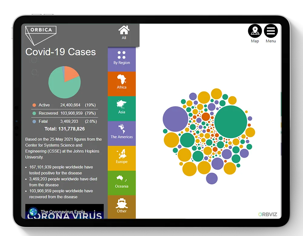
This picture demonstrates more succinctly than 1000 words the global distribution of COVID-19.
It’s from an interactive web application that’s now free online at https://covid-19.orbviz.com. It uses a series of colour-coded, interactive bubbles - rather than a map - as the primary visualisation to demonstrate the world-wide impact of the virus.
Maps are awesome, but they’re not always the easiest way to understand data at a glance said Kurt Janssen, founder and CEO of Christchurch-based location intelligence company Orbica, which developed the application.
“I’m a geographer by trade so of course a map is like a default setting for me. But sometimes there are better ways to use location data to tell a story and help people understand what’s really happening.”
The web application uses daily-updated data from Johns Hopkins Centre for Systems, Science and Engineering. The homepage is a series of bubbles that represent countries, which are colour coded to represent the regions they belong to. The bigger the bubble, the more COVID-19 cases the country has experienced. You can hover on a bubble to discover the amount of active, recovered and fatal cases, or click on it to explore the data from a region-wide perspective. There is also a map view that shows the geographic dispersion of the disease and which regions are most impacted.
The web application was created using a software-as-a-service product developed by Orbica, OrbViz, which is usually utilised by local governments, not-for-profits and large corporates to visualise budget distribution, Janssen said.
“Our team thought that it’s a novel way to show what’s relevant and happening in the world right now. The data is there to support it so it’s a good example of how important open and transparent data is, especially in times like this. But at the same time, we have to make that data accessible to the masses in a way that’s easily understood.”
Orbica will update the site daily and is working on country-specific sites.
